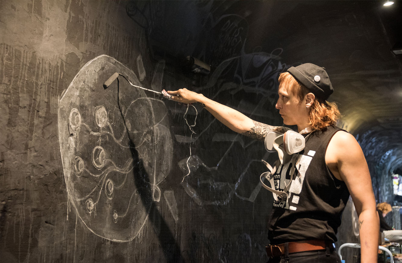
Magdalena (“Magwie”) runs a street art workshop as part of our creative retreats in Berlin. They’re a huge inspiration to us, and we can’t wait to see how they inspire you too.
Mag is an artist of astonishing visual variety, with a truly impressive array of cool characterful work, from external and internal murals, to paintings and sculptures, to illustration, character design and graphic recording, and even stonemasonry.
It’s not every day you meet somebody who used to carve gravestones for a living. They have earned a master’s degree in stone sculpting (Meisterbrief im Steinbildhauerhandwerk), “just to be sure I had something in case drawing didn’t work out.”
We love Orble! Can you spot him here?
Paste-ups and murals: Mag the street artist
We’re incredibly excited to have Mag along to host a street art workshop as part of our Berlin creative retreat. When it comes to street art, Mag has a lot of experience with (legally) painting walls, and paste-ups. Paste-ups themselves are illegal to put up, but they do not damage walls or need expensive paint removal (like with spray paint).
Their attitude is to be present as much as possible. Slow down, feel the “now” and celebrate the little details that life has to offer… and maybe even add another one on top.
Networks and collaborations: Mag and Berlin
“Berlin was perfect to start what I did. I was old enough to come here and not get lost. I started to volunteer as an Illustrator and meanwhile jumped right into the street art scene. During that time, I met Christoph Kellner, a real Graphic Recording old-schooler, that brought me into Graphic Recording business and then I had enough time and money to develop all my styles in a constant ping pong between analogue and digital projects.”
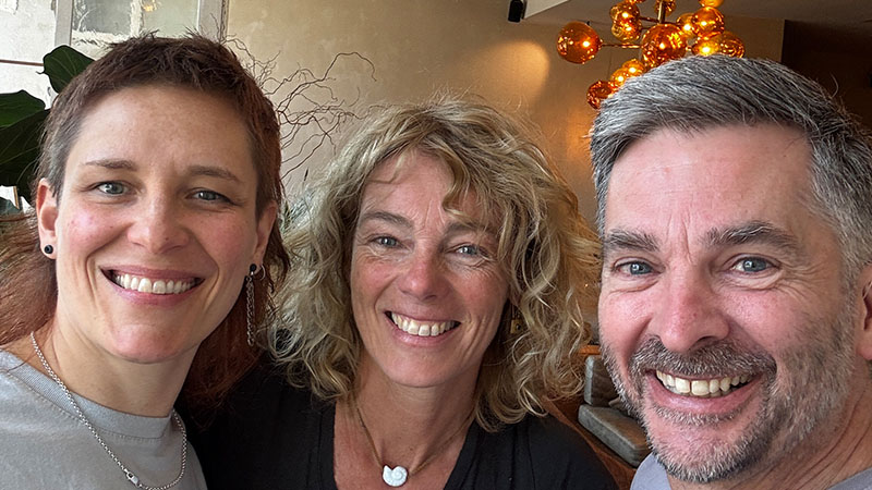
It’s so good having Mag as part of the Inking Abroad family! Pictured here with hosts Axelle and Ben
A peek into Mag’s creative process
Character design is one of the things that Mag has done since they were seven. There are characters you’ll see in some of Mag’s past artworks called Orble.
Orble was ‘born’ from drawing their childhood companion cat one night with their brother, at a party with their eyes closed, on little sheets of paper: “I had this one character in mind but doing it with closed eyes created such wonky dudes that we burst out into laughter. That’s why they look so funny and quite out there. This is a good example on how to shut up your brain and let the style begin to flourish”
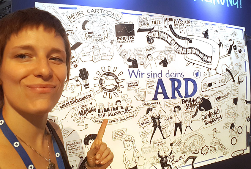
As if being an awesome street artist and stonemason wasn’t enough, Magdalena Wiegner is also a brilliant graphic recorder
“Improving my art is a natural process. I am a style – inventor, so I could never just do the same kind of thing over and over. I need a variety of styles to express a variety of things.”
Here’s a fresh way to think about storytelling, design, and how to be more intentional about guiding what your audience actually notices, with the Golden Ratio.
What’s your point of view?
Most creative professionals I meet don’t need more tools. They already have pitch deck frameworks, brand systems, Figma templates, templates for templates, and yes AI tools too… And yet, when it comes to communicating something that really matters – a strategy, a product, a change plan – the communication falls flat.
It’s not because they’re bad consultants or bad designers. The opposite, in fact; their ideas are really good. It’s just that there’s no clear point of view.
We’re taught to “present information.” But as a lot of us know, audiences don’t remember information, they remember stories. And stories always have a perspective. A point of view is what turns complexity into meaning. It’s what tells your audience what matters, what doesn’t, and why they should care.
The same is true in visual storytelling. A good composition isn’t just a collection of elements. It’s a quiet argument about where to look first, what to notice, and what to feel.
Florence, proportions, and why the Godlen Ratio matters
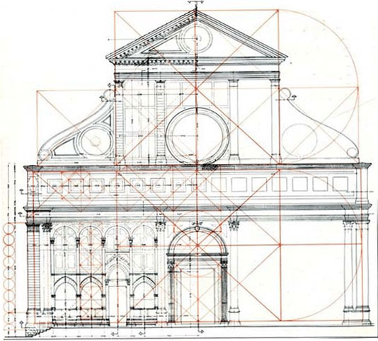
There’s a reason we explore this in our Inking Abroad creative retreats in Florence. This city isn’t just beautiful, it’s opinionated. During the Renaissance, artists and scholars became obsessed with proportion, balance, and harmony. One of the ideas they revived from classical Greek mathematics was the Golden Ratio, a proportion of roughly 1.618, thought to create a sense of visual balance that feels natural and pleasing to the human eye.
The facade of the Basilica of Santa Maria Novella by Leon Battista Alberti is a poster child of applying the 1.618… Golden Ratio proportion to the spacing of its columns, arches and doors.
You see it everywhere here: in the facades of churches, in the spacing of windows, in the rhythm of streets and piazzas.
It’s often romanticised as “the secret code of nature,” but honestly, that’s all mostly myth. I hate to break it to you, but you know how we’re told the nautilus shell and galaxy spirals follow that ‘Golden Spiral’? Nope, they don’t.
But here’s the truth that matters more: When you arrange things using the proportions and curves of the Golden Ratio, it still does kinda feel… right. Not because the universe demands it, but because the human eye responds to it really well.
And that makes it a powerful tool for anyone who communicates visually, no?
How we teach the Golden Ratio at the retreat
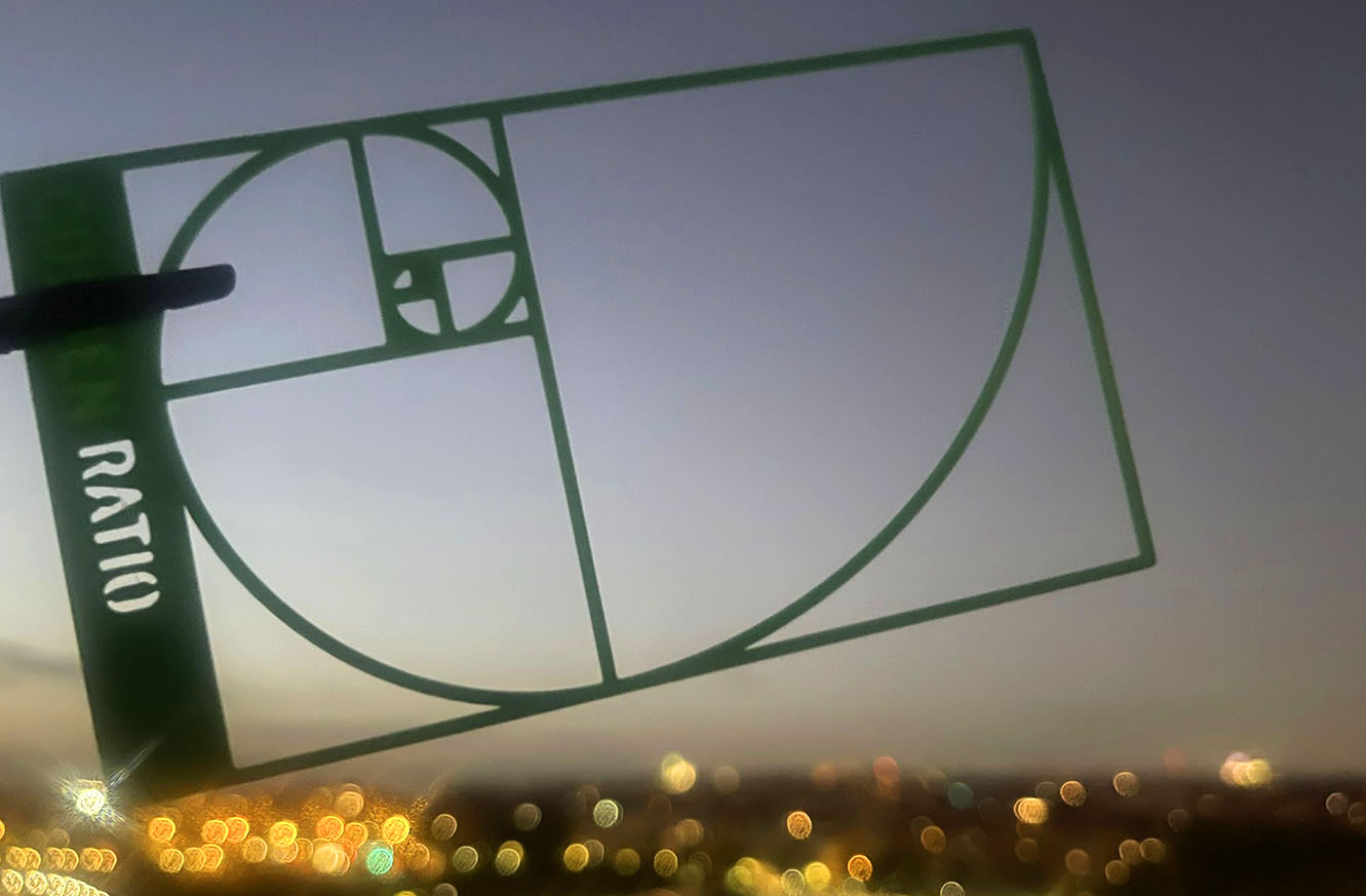
At our Florence creative retreat, everyone gets a golden ratio template in their kit. It’s cute and deceptively simple – just a 3D-printed plastic spiral and some proportional rectangles – but it changes how you see.
We use it in two ways. The first is for observation. As participants walk through the city, and hold the template over building facades, piazzas, street corners, and so on, they start noticing more. Noticing relationships and proportion; how elements cluster, how tension forms, how balance emerges or breaks.
They don’t just look more. They see more. And I love that about their experience! That shift from passive looking to active noticing is such a powerful booster for creativity.
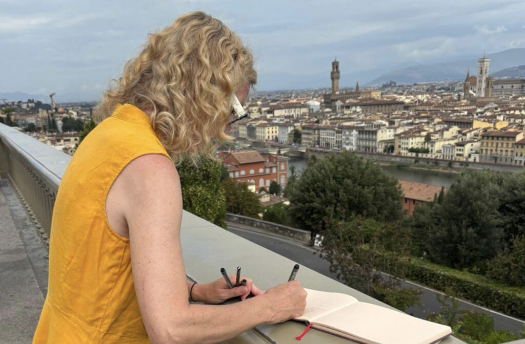
One of our creative retreat participants sketching the panorama from Piazzale Michelangelo
The second way we use it is for composition. Back in the workshop room, participants arrange elements that are part of the visual narrative they want to tell as sketches, where those elements are placed on the lines of the template. It’s a great guide to help them express a point of view more intentionally.
Rules are made to be broken
As Pablo Picasso said, “Learn the rules like a pro, so you can break them like an artist.”
You don’t have to look far in art and design to see that some of the most powerful visual narratives are created by breaking balance, by pushing elements out of place, or letting something feel… “wrong.”
But you can only break rules with intention if you know what the rules are. Which is what the Golden Ratio (and our little template) gives you: a baseline for harmony. So when you disrupt it, it actually means something.
You can’t challenge a narrative unless you’ve first chosen one.
This is what we really teach
So, yeah, our Inking Abroad retreats aren’t really about learning another layout. They’re about learning how to think visually:
How to decide what matters about a story you want to tell.
How to guide the audience’s attention.
How to turn complexity into something someone else can feel.
Florence just happens to be the perfect classroom!
If that kind of creative clarity is something you’re craving, you’ll find it here; not in more slides, but in learning how to see, frame, and tell a story with intention.
And sometimes, all it takes to start is a 3D-printed spiral held up to a very old city.
What if the most powerful lessons in visual storytelling were waiting for you on the streets of Florence, hidden in plain sight?
The first time I was in Florence, I didn’t go looking for street art. I was just walking through the narrow streets, taking in all the sights and sounds of this fascinating city.
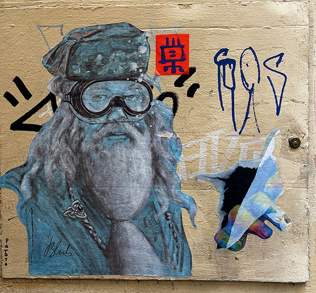
Then I saw it. A cut-out paper print of a drawing of Dumbledore (of Harry Potter fame), but wearing a snorkelling mask, wheat-pasted over the top of some graffiti, signed Blub.
This was a very ‘un’-Renaissance image pasted on a very Renaissance-looking ancient wall. It was odd, and out of place. It was ‘illegal’ but it was more than just a furtive spraypainted tag: it invited curiosity rather than being a rude intrusion. And the more I walked around, the more and more street art like this I found.
“Happiness can be found, even in the darkest of times, if one only remembers to turn on the light” – A wheat-pasted printed artwork of Dumbledore by anonymous Florentine artist Blub, who always adds goggles to his subjects
In a city that was already teaching me fantastic lessons about visual storytelling through traditional Renaissance art, the city totally took me by surprise by showing me even more lessons to learn through this street art.
Visual storytelling pulls you in
Street art – good street art – doesn’t ask politely for your time. It interrupts you. There’s always something about it that is just too damn interesting to ignore, and this interruption gave me an insight into how good visual storytelling works. Good visual stories don’t shout; they pull.
When we walk the streets of Florence during the Visual Storytelling Creative Retreat, we’re not hunting for ‘content’; we’re practicing something far more valuable: noticing. Not only noticing a piece of street art, but noticing how we notice. We try to deconstruct that ‘pulling power’ of the various elements in any piece of street art.
Is there something really familiar to us, but presented in a novel way (like Dumbledore in a snorkelling mask)?
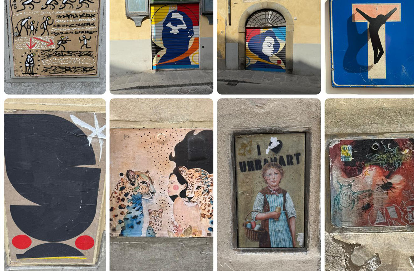
Is there something that pulls at our emotions (like the wispy whimsical figures hand-in-hand below)?
Are there two or more elements juxtaposed in a curious or uncomfortable way (a modern character on an ancient surface, or one bright garish colour amongst muted colours)?
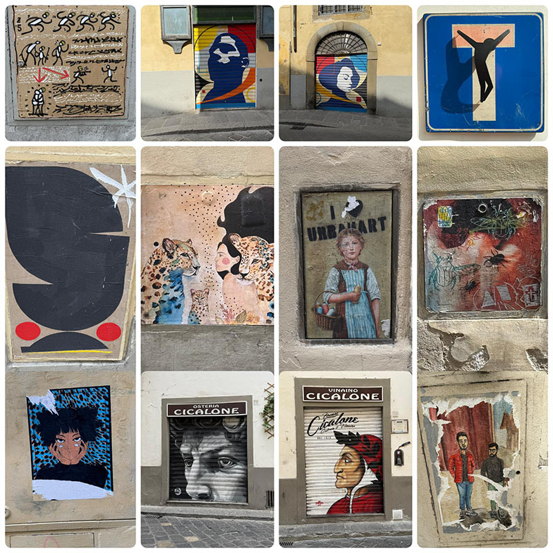
A great range of examples of the sort of street art you see in Florence
So when it comes to crafting our own visual stories, a great thing to think about is: How are my visuals pulling people in?
Visual storytelling provokes the right questions
Speaking of noticing how we notice, when you really look at (good) street art, a few questions often arise:
What is the artist trying to say?
Why this image, this symbol, this moment?
Why here?
Street art is enigmatic. It can’t look too familiar (otherwise our brain goes “yawn” and moves on), and it can’t look too unfamiliar, otherwise there’s nothing to identify and relate to. Also, it can’t be too safe (otherwise we might parse it as an ad), but it can’t be too offensive either (like random stabs of graffiti).
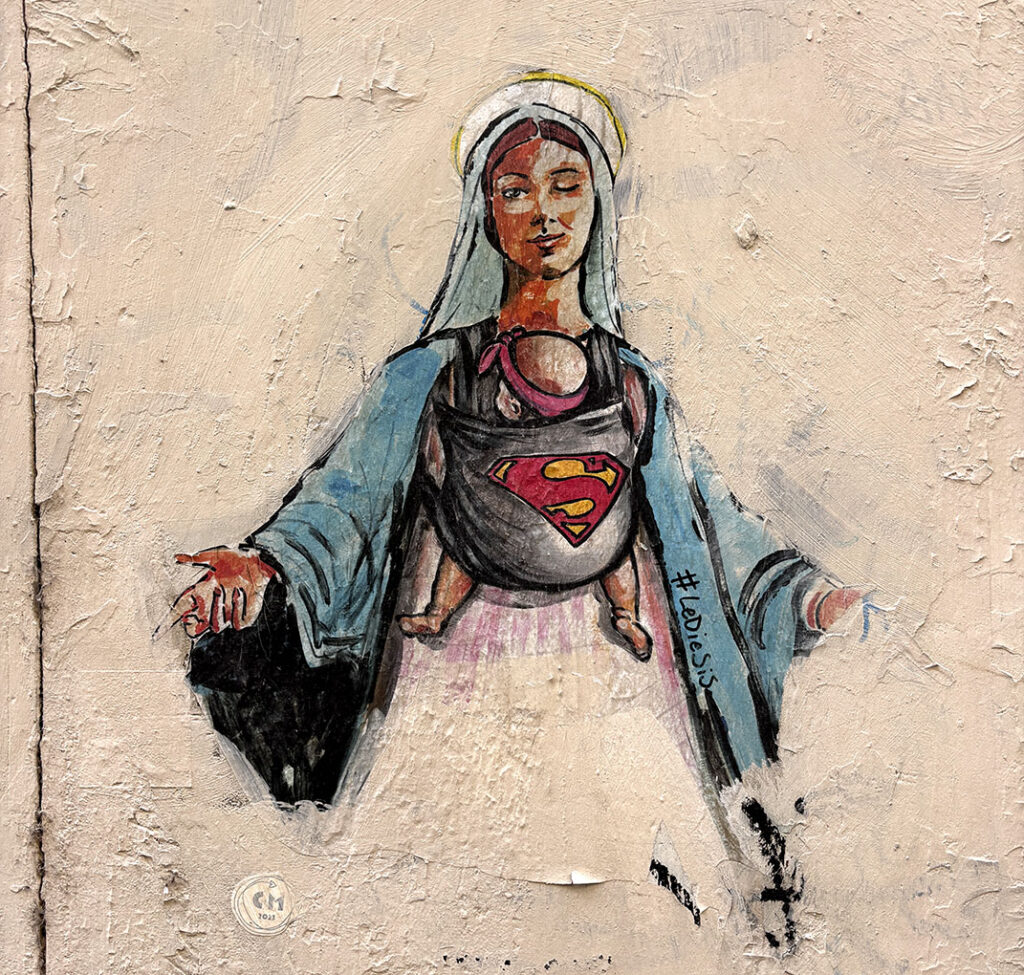
A cool piece by artist Lediesis, who tends to incorporate the ‘Super’ logo or other shield logos onto female subjects in new and interesting ways.
In the piece above by Lediesis (two women who post under the same moniker), a very traditional Renaissance depiction of Mary is shown with a baby in a sling with a ‘Super’ badge on it, reframing this conventional mother persona in a really contemporary way. The wink also adds humour and charm. It dances the line well; it’s challenging without being too confronting to any religious sensibilities. It makes us ask questions about our traditional perceptions of motherhood and empowerment.
There’s a reason why people tune out in PowerPoint presentations. They’re just too familiar. They tend to follow the same patterns, with the same slides made from the same templates. So much of the street art in Florence seemed to instead provoke curiosity; our brains can’t help but start asking questions.
So, the lesson I take here is that good visual stories have a provocation. It’s often really handy to look at the visual story you’re making and ask yourself: What questions are my visuals getting the audience to ask, to keep them hooked to think more, and find out more?
Visual storytelling shows, not tells
As I said above, street art rarely explains itself; it’s enigmatic on purpose. But it often reveals its meaning through showing us, not telling us. Like the piece by Lediesis above, we’re not being ‘explained to’ about how the motherhood role has changed in modern times, but instead we’re being shown a traditional mother figure wearing something ‘non-traditional’: a baby sling. Also, the baby is wearing a headscarf in a ‘non-traditional’ way.
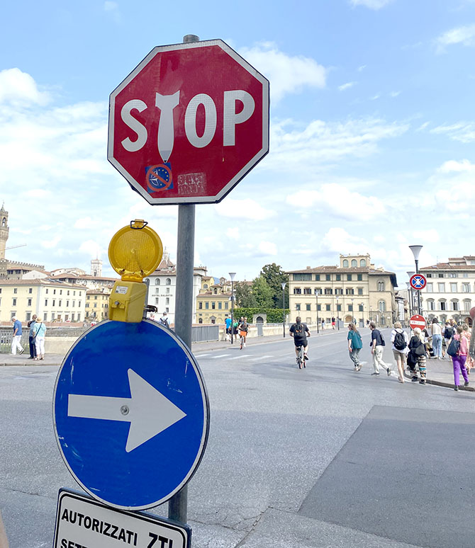
Florence street artist Clet keeps himself busy by hacking the city’s road signs to bring different messages, often with a minimal amount of change to each sign
The way that Florentine artist Clet Abraham doctors street signs into different meanings is a great example of this, too. By overlaying iconography and other graphics onto various signs, he uses the existing power of a sign in new, creative ways. As the viewer, we get to connect some dots. We can to interpret it how we want, based on our own understanding. And in doing this, a relationship is formed between the piece, the message, and the viewer. So, good visual stories invite participation.
Visual storytellers often talk about audience engagement: how do your visuals engage your audience’s head, heart and hands?
Visual storytelling can take risks
This one’s a bit random, but I couldn’t leave it out. I think it takes guts for street artists to put their work into the world, knowing it might disappear tomorrow. No likes. No guarantees. And – with a lot of street art – no permission. Good visual stories show courage.
For visual storytellers, it’s a powerful reminder that it’s OK to take risks to show our work to see what works and what doesn’t. It doesn’t need to be perfect. It doesn’t need to be polished. It doesn’t always need to ‘fit the narrative’, or fit with everyone else’s expectations. What’s often better is that it’s honest, and authentic to its subject and authentic with its audience. It might be confronting, but I want to encourgae you to think: how do your visuals show up with authenticity?
Join us
We run several different creative retreats, and our next one is our Visual Storytelling Creative Retreat in Florence, on 17-19 April 2026. It’s designed for people who tell stories and give presentations at work (illustrators and graphic recorders, but also facilitators, trainers and consultants). It’s for people who want to open up their own creativity, sharpen their observation skills, and hone their storytelling skills, all with a group of like-minded creative souls.
We’ll walk the streets of Florence and taste the best of its fine food (and coffee!). We’ll take in not only some street art, but the art at Galleria dell’Accademia di Firenze. We’ll observe and reflect. We’ll draw and sketch, and share several visual storytelling frameworks and methods. And everyone has the opportunity to translate all this into their own story and their own creative practice.
Right now, there’s an earlybird discount, too! €200 off your registration, for a limited time.