Here’s a fresh way to think about storytelling, design, and how to be more intentional about guiding what your audience actually notices, with the Golden Ratio.
What’s your point of view?
Most creative professionals I meet don’t need more tools. They already have pitch deck frameworks, brand systems, Figma templates, templates for templates, and yes AI tools too… And yet, when it comes to communicating something that really matters – a strategy, a product, a change plan – the communication falls flat.
It’s not because they’re bad consultants or bad designers. The opposite, in fact; their ideas are really good. It’s just that there’s no clear point of view.
We’re taught to “present information.” But as a lot of us know, audiences don’t remember information, they remember stories. And stories always have a perspective. A point of view is what turns complexity into meaning. It’s what tells your audience what matters, what doesn’t, and why they should care.
The same is true in visual storytelling. A good composition isn’t just a collection of elements. It’s a quiet argument about where to look first, what to notice, and what to feel.
Florence, proportions, and why the Godlen Ratio matters
There’s a reason we explore this in our Inking Abroad creative retreats in Florence. This city isn’t just beautiful, it’s opinionated. During the Renaissance, artists and scholars became obsessed with proportion, balance, and harmony. One of the ideas they revived from classical Greek mathematics was the Golden Ratio, a proportion of roughly 1.618, thought to create a sense of visual balance that feels natural and pleasing to the human eye.
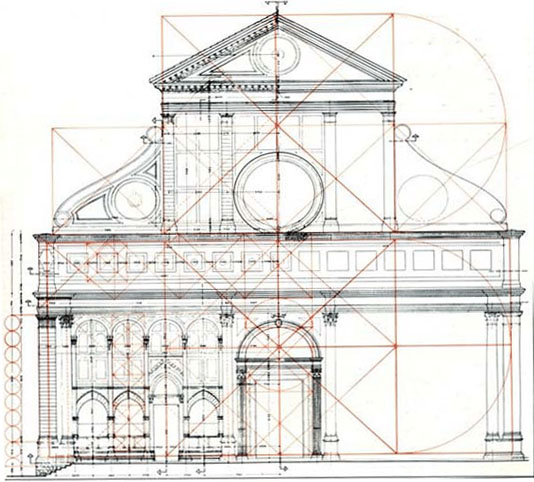
You see it everywhere here: in the facades of churches, in the spacing of windows, in the rhythm of streets and piazzas.
It’s often romanticised as “the secret code of nature,” but honestly, that’s all mostly myth. I hate to break it to you, but you know how we’re told the nautilus shell and galaxy spirals follow that ‘Golden Spiral’? Nope, they don’t.
But here’s the truth that matters more: When you arrange things using the proportions and curves of the Golden Ratio, it still does kinda feel… right. Not because the universe demands it, but because the human eye responds to it really well.
And that makes it a powerful tool for anyone who communicates visually, no?
How we teach the Golden Ratio at the retreat
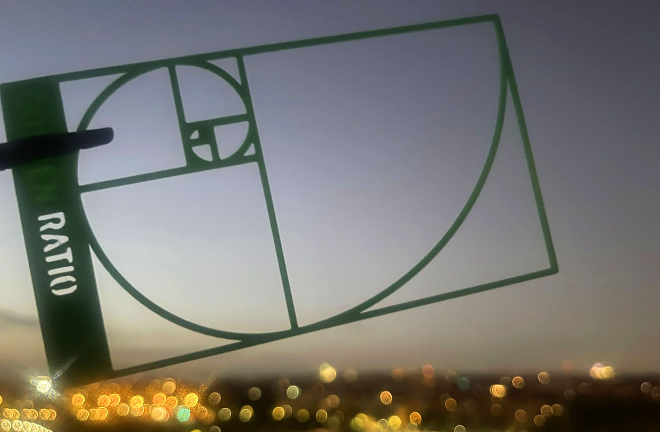
At our Florence creative retreat, everyone gets a golden ratio template in their kit. It’s cute and deceptively simple – just a 3D-printed plastic spiral and some proportional rectangles – but it changes how you see.
We use it in two ways. The first is for observation. As participants walk through the city, and hold the template over building facades, piazzas, street corners, and so on, they start noticing more. Noticing relationships and proportion; how elements cluster, how tension forms, how balance emerges or breaks.
They don’t just look more. They see more. And I love that about their experience! That shift from passive looking to active noticing is such a powerful booster for creativity.
The second way we use it is for composition. Back in the workshop room, participants arrange elements that are part of the visual narrative they want to tell as sketches, where those elements are placed on the lines of the template. It’s a great guide to help them express a point of view more intentionally.
Rules are made to be broken
As Pablo Picasso said, “Learn the rules like a pro, so you can break them like an artist.”
You don’t have to look far in art and design to see that some of the most powerful visual narratives are created by breaking balance, by pushing elements out of place, or letting something feel… “wrong.”
But you can only break rules with intention if you know what the rules are. Which is what the Golden Ratio (and our little template) gives you: a baseline for harmony. So when you disrupt it, it actually means something.
You can’t challenge a narrative unless you’ve first chosen one.
This is what we really teach
So, yeah, our Inking Abroad retreats aren’t really about learning another layout. They’re about learning how to think visually:
- How to decide what matters about a story you want to tell.
- How to guide the audience’s attention.
- How to turn complexity into something someone else can feel.
Florence just happens to be the perfect classroom!
If that kind of creative clarity is something you’re craving, you’ll find it here; not in more slides, but in learning how to see, frame, and tell a story with intention.
And sometimes, all it takes to start is a 3D-printed spiral held up to a very old city.